| Author |
Thread Statistics | Show CCP posts - 25 post(s) |
|

CCP Phantom
C C P
C C P Alliance
5755

   |
Posted - 2015.06.02 09:57:42 -
[1] - Quote
Carnyx has been successfully deployed on June 2 during an extended downtime.
Carnyx brings many new features to EVE Online, including fully revamped icons in space and in the overview, the first set of sovereignty changes, fantastic new graphic shaders, module rebalances, the Caldari Tech-3 destroyer "Jackdaw" and more.
You can check out details of all these features on the new Updates webpage, here.
The full details of all changes and improvements are available in the patch notes.
For general discussion and feedback regarding Carnyx, please use this thread.
Please report issues with the release on the PC in the Carnyx issues thread. For Mac users, there is, as always, a thread on the Macintosh forums for discussion of this release here.
CCP Phantom - Senior Community Developer - Volunteer Manager
|
|
|

CCP Claymore
C C P
C C P Alliance
134
|
Posted - 2015.06.02 13:22:12 -
[2] - Quote
Steijn wrote:Xen Solarus wrote:So far, like the new symbols. Going to take a while to get used to, but it's going to be super useful to see ship sizes at a glance. Nicely done CCP!  My biggest gripe is that EvE in windowed mode now dominates over all other programs. Nothing can be moved on top, browsers, team-speak, not even the damn launcher itself. Seriously, It's already ****ing me off big time. Anyone know a solution?? what UI scaling are you using? On 90% they are really bad.
We are aware of issues at 90% UI Scaling and we are looking at better ways to handle this.
The issue is with UI Scaling and not the new icons.
Quality Assurance Analyst
Team Game of Drones
|
|
|

CCP Fozzie
C C P
C C P Alliance
12909
|
Posted - 2015.06.02 13:33:07 -
[3] - Quote
This has been the case long before Carnyx, and is by design.
Drones will never take an action that causes their owner to get a crimewatch flag unless the owner explicitly instructs them to. Basically going flashy is cool, going flashy without any choice in the matter is not.
Game Designer | Team Five-0
https://twitter.com/CCP_Fozzie
http://www.twitch.tv/ccp_fozzie/
|
|
|

CCP Lebowski
C C P
C C P Alliance
602
|
Posted - 2015.06.02 17:12:23 -
[4] - Quote
Azrael Sheriph wrote:Did you seriously allow station serives to be entosised during non vulnerability hours?
i though you were smarter than that.
cause if you did
1 your giving the defender daily quests.
2 your giving a total licence to troll to attackers
3 your giving complete free kills to pirates (which we all though was the point of a vunrablity window)
gj ccp Yes this was always part of the design, station services have always been vulnerable at all times.
CCP Lebowski | EVE Quality Assurance | Team Five-0
@CCP_Lebowski
|
|
|
CCP Lebowski
C C P
C C P Alliance
602
|
Posted - 2015.06.02 17:30:04 -
[5] - Quote
SilentAsTheGrave wrote:Someone explain to me the reason the notification caused by the Entosis Link is game wide? System or constellation wide sure, but universe wide goes directly against the idea of the new sov system. This was always part of our design. The full system will also include a dashboard showing you the status of all Sov structures in your alliance, what matters is that you will need to be there to defend it.
CCP Lebowski | EVE Quality Assurance | Team Five-0
@CCP_Lebowski
|
|
|
CCP Claymore
C C P
C C P Alliance
138
|
Posted - 2015.06.02 18:05:36 -
[6] - Quote
Panterata wrote:Hey Lebowski, who is responsible for the icons?
Tell him to write something here on the players and not hide as a mouse!
That would be me and my team, Team Game of Drones.
We are reading the feedback you are providing.
All I can say at the moment is please take some time to get used to the new icons if this is the first time you are seeing them. It has been a while since they last changed, if ever, and it will take a while to learn them again.
We are aware that the new icons do not look great with 90% UI Scaling. This is an issue we are looking at but is a bigger project due to the nature of UI Scaling.
We are monitoring your feedback and will try and respond to your issues and concerns.
Thank you for all your feedback so far.
Quality Assurance Analyst
Team Game of Drones
|
|
|

CCP Surge
C C P
C C P Alliance
73
|
Posted - 2015.06.02 19:53:22 -
[7] - Quote
Joia Crenca wrote:
Thanks for responding!
I'm also getting the feeling that it's not just at 90% that it's a problem, and even after some time, the testing folks still were not happy. We were actually given the same response during Incarna, concerning the unusable/unreadable UI icons then.
Hi, let me reclarify a bit here.
The 90% scaling problem is engine-level. Specifically our UI renderer doesn't support any texture filtering or anti-aliasing, which makes any non-100% scale texture look pretty bad across the UI. It's particularly blatant when scaling single-pixel wide strokes as in the new icons.
And unfortunately re-writing the UI renderer, or bolting on some AA tech is just an item that hasn't made it to the top of the engine team's priority list. But we're aware of the issue.
In the end we support "UI scaling" functionality to some extent, but don't have the proper tech in place to make the experience feel great at anything other than 100% at the moment.
I'm also curious to hear more from, and maybe wasn't aware of how many users played with a 90% downscaled UI (as opposed to scaling up for accessibility reasons.) What are your reasons for doing so? |
|
|
CCP Surge
C C P
C C P Alliance
75
|
Posted - 2015.06.02 21:19:50 -
[8] - Quote
Also to address some of the concerns voiced, our overall aim was not to change the old icons just for the sake of something new or because we thought they weren't working, but to provide better granularity and at-a-glance awareness of the objects on grid.
But change is tough and we are definitely keeping an eye on your feedback in all channels as we had been during testing on Singularity for the past while. This relatively small icons swap isn't an end-all-be-all "tough luck" change we're aiming to saddle the playerbase with.
For now a few things
- I urge patience. There are dozens of new icons to learn, and it might take the brain a while to untangle the new "messy blob" at first. Post back in a few days and share if they've changed your game for better or worse after you've gotten a little more comfortable identifying them. We'll be keeping an eye on this post initial-reaction feedback closely.
- Check out this image to help learn your icons: http://images.contentful.com/kvd74o0q2fjg/4Hgu1BcYAE22wgokiKeYO4/4001f1c3132cc7749d9d25ec8851798e/NewOvervieBracket-IconsImage.jpg?w=1920&fm=jpg&q=85
- While GÇ£deconstructive feedbackGÇ¥ is cathartic in some ways I am sure, itGÇÖs likely not going to help get your point across. We are looking for specific feedback: What specifically don't you like about the new icons? Can you share an in-game story or experience which backs up your conclusions? It's the kind of feedback that's most useful to us when making calls on these types of things.
- We've taken seriously the calls to include a "use classic bracket icons" option. Originally we thought having two sets of icons in the client might just cause confusion and miscommunication among players, and tough learning/teaching decisions for newbros as well as vets welcoming them in. However these concerns might be overblown, especially in regards to little bracket icons. In any case its definitely a debate worth having.
Thanks for reading!
|
|
|
CCP Surge
C C P
C C P Alliance
77
|
Posted - 2015.06.02 21:35:53 -
[9] - Quote
Porucznik Borewicz wrote:OK, so after an actual elite PVP fleet I have some more feedback regarding the new overview icons / brackets. Apart from the fact that the drones Xes need to come back, because the new icons look just silly and clutter the view anyway, there is one major issue with the new icons - they are unreadable when no standings / background colours are set towards a neutral player you are fighting. Stuff just looks too much the same. And the more things you have on your OV the more you are screwed. The new icons are OK-ish in a way. You could get used to them. We just need a more "at a glance" way to tell the player controlled ships in space. Like a colour maybe. Making the player ships green for instance would help me a lot. And I bet a lot of colour blind people would also welcome the option to change player ships colour. Right now, everything on the OV that is not a waypoint object (stargate, station) has the same colour. The other way would be reverting the old brackets for player ships.
TL;DR: Let me change the player controlled ships icons colour and it will be much better.
Hey, thanks for sharing your experience. And keeping in mind color blindness :) I agree NPC distinction is rather nuanced with the new icon set - NPC icons have a faint inner fill compared to players ships.
We also color hostile NPCs red by default, but we don't allow players to change this, or set any color for the icons themselves besides background and colortags.
Anyone else think a custom "icon color" would be a good option to expose to aid in situational awareness? |
|
|
CCP Lebowski
C C P
C C P Alliance
603
|
Posted - 2015.06.02 23:06:34 -
[10] - Quote
DexterShark wrote:- I am not sure why all the station services have a circle around them. Presumably this is the Entosis counter, which is fine if those services are being contested, but it displays all the time. Can you confirm that this is a bug to be ironed out? You're right that the circles around the station services represent the entosis status of the service.
Removing them when they aren't moving or you don't have them selected is on our list for the next iteration.
Thanks for the feedback!
CCP Lebowski | EVE Quality Assurance | Team Five-0
@CCP_Lebowski
|
|
|
CCP Lebowski
C C P
C C P Alliance
605
|
Posted - 2015.06.03 13:46:37 -
[11] - Quote
Sgt Ocker wrote:Station services will be vulnerable 24/7 even after Aegis - It is part of the design that they be vulnerable at all times.
CCP Lebowski, is correct they were always vulnerable. He just neglected to mention, now they are sooo much more vulnerable now as it only takes 1 person a few mins to achieve what it took a fleet several hours to do.
The fact station services are so easily disabled at any time is meant to be a content driver.. To ensure your station remains usable you only need to have people on 24/7.
Spc One wrote:Well i saw few people in 0.0 taking out services with noob ships in 5minutes.
So now, everyone with 5minutes time and noob ship can take out any station service, later stations i guess.
I think people will stop using conquerable stations, because this mechanic is just dumb.
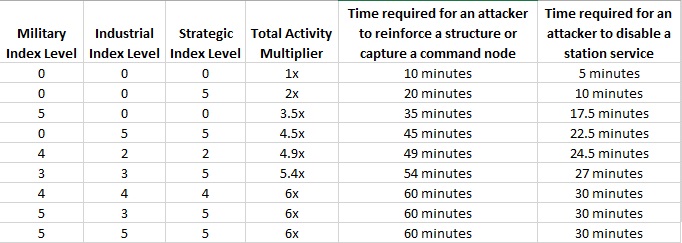
Whats been said here is not quite correct, including spool up time (The first cycle of the module does nothing) disabling a station service will take at least 7 minutes (T2) or 10 minutes (T1). Additionally this is only in an entirely undeveloped system. With the indexes raised it becomes longer (Note that the time to reactivate is not affected by the indexes so will always be 10 or 7 minutes). See this chart for the exact info:
Saisin wrote:Please do not remove the circles on the disruptable services icons.
They are red when the service has been disabled, and this clearly shows which services are active and which are not, and need to remain visible when cloaking and scouting a station, without having to select them.
Players that do not want to see them should simply turn the services icons off in their brackets/overviews.
The plan right now is to have the circles much less opaque when unselected and inactive (As in not being captured or reactivated). They will still be visible, just not to the same degree. Additionally, this will not apply to the actual station service icon, they will be visible as normal, and will be colour coded based on their status (red for disabled, white for active). All the changes will be on a test server for your feedback as soon as I can get them there!
Aeon Veritas wrote:Do I understand that correctly that we can pre-set our default vulnerability timers but they are useless until after Aegis?
That would leave the sation Services 24/7 vulnerable. Hopefully a misunderstanding of mine... Nope not a misunderstanding, station services will always be vulnerable. Any member of the owning alliance can defend against attacks or (failing that) reactivate the service within 10 or 7 minutes. This is fully part of the design.
Lady Magneta wrote:"Frequency of Burner Missions offered by level 4 Security agents has been lowered."
So yeah, why don't we bring back the dull and disgustingly bad "normal" level 4s, which we had the pleasure to grind on the last decade.
Burners were are great change and a good risk for isk reward for those willing to take it, I noticed this change was not so small after all, even by adding a new Angel Cartel burner ( which has the same 300k reward and 1800 lp bug the others had when first introduced ), the rate of burner offers was lowered by a not so small margin. This just makes me sad, it was a fun and quick isk to be had. The lower rewards are not a bug, missions rewards are dynamically set (By space magic) and should even out over time. Don't forget that the mission also contains NPCs with fairly decent bounties and a chance to drop faction shinies!
CCP Lebowski | EVE Quality Assurance | Team Five-0
@CCP_Lebowski
|
|
|
CCP Lebowski
C C P
C C P Alliance
606
|
Posted - 2015.06.03 15:48:29 -
[12] - Quote
Aeon Veritas wrote:Thanks for the clarification!
Now lets talk about the by far most discused feature of this patch, the icons....
Can you at least tell us that they will be reconsidered? It's really not my place to comment on features developed by another team. As Claymore and Surge have already said they are reading and considering all your feedback.
CCP Lebowski | EVE Quality Assurance | Team Five-0
@CCP_Lebowski
|
|
|
CCP Surge
C C P
C C P Alliance
93
|
Posted - 2015.06.04 14:21:15 -
[13] - Quote
Milla Goodpussy wrote:i want the old icons back,
im afraid since the majority of the community is saying the same. ccp has put on the wall module and are no longer paying any attention to this thread.
That's not true. We're definitely still keeping tabs on this thread and assessing the situation. Just don't expect any knee-jerk reactions from us so soon. For now keep the feedback coming, keep it constructive. Thanks |
|
|
CCP Surge
C C P
C C P Alliance
97
|
Posted - 2015.06.09 22:04:30 -
[14] - Quote
I just finished reading through the latest rounds of feedback, and we've discussed the situation internally in depth now. So here's where we're at now, and the options we're considering with the icons:
- First we hear from many of you the difference between NPC and player ships is simply too subtle with the new icon set, and we're right now experimenting with alternatives to separate these groups more, maybe adding entirely new shapes for NPC ships to make them more clearly stand out from players.
- 90% UI scaling is definitely an issue, but a tricky one to solve. We we know its an underlying rendering issue that's been around much longer and not caused by the icons themselves, but once that's been suddenly and very clearly illuminated by their release. We want to keep 90% scaling as a option, but at the same time acknowledge that it will never look as good or be as cleanly supported as the other modes. We're also looking into whether we can easily add texture filtering which will make the icons smoother and slightly more readable at 90%.
- We also hear the general usability concern that item "groups" are not as clearly differentiated as with the old set (crosses vs brackets, vs Xs) and that many new icons are too detailed to identify quickly. In the previous iteration the ISIS-based overview icons were pulled back for this very reason: they were too difficult to quickly make out at the smaller Overview size.
While we've added many new icons for separating types within a group, it has been at the cost of taking slightly longer to identify which group has appeared on grid (A player ship, NPC, or drone). It's also exacerbated by as-mentioned eyesight/accessibility problems and quick blob identification of a shape. I think this is at the root of many of your concerns, and we're now looking into what can be done to make groups of items slightly more distinctive, potentially giving people the option to use simpler group icons for brackets that's closer to the old system.
- We're meeting with the CSM later this week to discuss much of this feedback, and I'm sure many of your concerns will be represented as well. Either way the significance of this and your well reasoned responses in this thread aren't lost on us. I'll keep poking in here to keep you guys updated on any further actions coming with regards to the icons.
|
|
|
CCP Claymore
C C P
C C P Alliance
161
|
Posted - 2015.06.16 11:09:06 -
[15] - Quote
Hey everyone,
Apologies for the silence about the icons but we have been following this thread with great interest.
We have been listening to your feedback and discussing where to go from here. We had a very productive meeting with the CSM last week about the current icon situation and the release of them. There will be a blog coming out once we have dotted the i's and crossed the t's where we will explain why we changed them and improvements we plan to implement from the feedback received on this thread.
Please keep giving us the constructive feedback you have supplied so far.
Quality Assurance Analyst
Team Game of Drones
|
|
|
CCP Claymore
C C P
C C P Alliance
161
|
Posted - 2015.06.16 11:52:07 -
[16] - Quote
Iphigeneia wrote:CCP Claymore wrote:Hey everyone,
Apologies for the silence about the icons but we have been following this thread with great interest.
We have been listening to your feedback and discussing where to go from here. We had a very productive meeting with the CSM last week about the current icon situation and the release of them. There will be a blog coming out once we have dotted the i's and crossed the t's where we will explain why we changed them and improvements we plan to implement from the feedback received on this thread.
Please keep giving us the constructive feedback you have supplied so far. And presumably this blog will also explain why player feedback was discarded? I'm greatly interested to hear the answer on that one, as I've been following this thread and it sounds to me as though player reaction has been primarily (not completely or unanimously, however) averse to these new icons, while CCP reaction to feedback has been "we don't care." Now if that's not true I'm happy to be proven wrong, but as a rather new player I'm a bit discouraged that this situation with the icons -- something a lot of people have difficulty with -- will seemingly be glossed over with a "this is why we did it" blog post instead of a "we hear your concerns and this is how we'll fix it" post. The icons are blurry, messy, and make it far more difficult to discern quickly what is in front of me. I too have considered removing the icon tab altogether as not having them, frankly, seems preferable to being bewildered by them. No, I have not scaled my UI to 90% and I still say they are blurry. I play on a 1920 x 1080 resolution screen and daily find myself wishing for the clearness of the old brackets. Instead of mousing over to determine frigate/destroyer, as with the old system, I now find myself mousing over to determine battleship, cruiser, or battlecruiser. Specifically: -Battleship icon does not convey a much larger size vessel than a cruiser/battlecruiser icon. I recognise this one may simply be personal opinion but I keep wanting to think the house shap is a battleship and not a cruiser, just because it "feels" like a larger vessel than that rhomboid shape which is the battleship. -Large Collidable Structure icons are difficult to discern, either in space or in the overview list itself. -The pod icon, most of the structure icons, and the asteroid icons feel like they are cramming too many lines and pixels into far too small of a space, leaving the impression of a blurry mess to my eyes. I realise that my eyes aren't the clearest 20-20 vision but surely you must understand many people play with less than perfect vision. -While the drones icons are quite nice, as are the sun and acceleration gate icons, they too suffer from the too many pixels making it seem blurry issue that I have. -NPCs are NOT easily discerned. I play zoomed out fairly far and when arriving at a gate, I had a rather difficult time telling player battleships apart from the Concord battleships present. Now I know some people will say i merely need to assign colours to players so I can tell them apart from NPCs but really, the previous system of crosses and rectangular brackets worked very well, I do not see why that had to be removed in place of a barely discernible difference as this one is. -I believe in the case of overview icons that less is more. While it's nice that the various types of drones are differentiated, the various sizes of asteroids and ice are indicated, and we get a new icon for corpses ... I don't see that they were necessary. I only need to know whether it is a drone, not what kind of drone; I only need to know that it's an asteroid, I don't need to know it's size. -I can see that the old brackets left a lot to be desired in terms of describing what you are looking at. However, the old brackets and pluses and drone xs had this advantage: that they were INSTANTLY discernible. You never had trouble telling apart Concord from player battleships at a gate. You KNEW instantly that it was a drone and not a frigate orbiting you. They were also not blurry to look at. -for the love of god WHY did you take the triangle icon from the Mobile Tractor Unit and make it the frigate icon? I STILL start wondering why MTUs are shooting at me as soon as I see them on grid and I've been playing daily, which you'd think would be enough time to get used to that particularly nefarious change. If you had to reuse that triangle, could you perhaps have put it on something that wasn't piloted by a player? -WRECKS. The extra pixels in wrecks are wholly unnecessary. Again, blurry and harder to make out. I'm sure that's a lot of feedback but I'm really looking forward to reading this blog post. I'm getting cynical already and I'm not nearly old enough to be a bittervet but so far, the response from devs has been so underwhelming that I'm half expecting a post that doesn't address any player concerns at all.
We absolutely do care and player feedback has not been discarded, although hands up we could have been better at replying to this thread.
The blog will be both, why we did it, and after reading your concerns and feedback what we plan to do.
We understand that NPC are not distinguishable enough and that is high on our list to improve. We are also looking at drones.
Hopefully the blog will cover your concerns. We will be looking for more feedback like this once we have published it.
Quality Assurance Analyst
Team Game of Drones
|
|
|
CCP Claymore
C C P
C C P Alliance
161
|
Posted - 2015.06.16 13:46:44 -
[17] - Quote
Quote:
are you going to reinstate the old icons, even if only as a temporary measure?
The simple answer at the moment is no.
Without going into too much detail as the blog will cover it, we have ideas to simplify the current system from the feedback on this thread and discussions from the CSM.
Quality Assurance Analyst
Team Game of Drones
|
|
|
CCP Claymore
C C P
C C P Alliance
161
|
Posted - 2015.06.16 13:52:13 -
[18] - Quote
Tipa Riot wrote:CCP Claymore wrote:Hey everyone,
Apologies for the silence about the icons but we have been following this thread with great interest.
We have been listening to your feedback and discussing where to go from here. We had a very productive meeting with the CSM last week about the current icon situation and the release of them. There will be a blog coming out once we have dotted the i's and crossed the t's where we will explain why we changed them and improvements we plan to implement from the feedback received on this thread.
Please keep giving us the constructive feedback you have supplied so far. Looking forward to your blog, I think you got the pain points now.... but what I do not understand, why only now? The same quality feedback was given already weeks ago in the SiSi feedback thread. What sense does it make for us to test and give feedback there, if the changes go live anyway unaltered? Please go meet your colleagues working on the map, who acted a lot more clever to survive the field test by making the map optional.
So we were using feedback on SISI and made changes on individual icons and they did change from the first iteration to the release all based on feedback from SISI.
Perhaps we could and should have done more to address the issues we are now seeing are real issues, we will strive our hardest to make the icons better, at the moment reverting them back is not an option we are considering.
Quality Assurance Analyst
Team Game of Drones
|
|
|

CCP Sledgehammer
C C P
C C P Alliance
429
|
Posted - 2015.06.16 14:48:16 -
[19] - Quote
Ben Zaye wrote:can you tell me when you will correct the poor quality of the Golems skins (Basic skin and Kaalakiota Golem skin) ?
Hi Ben,
Could you be more explicit about what's wrong with the Golem's skins? Can I ask what Shader setting and Texture Quality setting you are using?
Best,
Sledgehammer
Graphical QA Analyst | EVE Quality Assurance | Team TriLambda
|
|
|
CCP Claymore
C C P
C C P Alliance
166
|
Posted - 2015.06.23 17:10:37 -
[20] - Quote
Hey folks,
So we have been chatting about what we can get ready for the next release, Aegis, to try and improve the icon experience.
Drones:
- We are going to reduce the number of icons for drones and change the icon so it is not similar to a ship icon.
90% scaling:
- We are going to increase the stroke thickness on icons to improve readability at 90% while retaining fidelity at 100%.
Player/NPC distinction:
- We are going to increase the fill on NPC ships and for friendly NPC ships add a blue tint.
We have been looking at these changes with the colorblind player in mind and we have looked at them through some simulators, but not being colorblind we really need your feedback if this is helping your experience. Colorblind players please let us know how they look and if they are better.
We should have these up on SISI before the weekend and will be taking all your feedback on board to make these changes as effective as possible before Aegis drops on July 7th.
There will not be any updates to Icons on TQ before July 7th.
Quality Assurance Analyst
Team Game of Drones
|
|
|
CCP Claymore
C C P
C C P Alliance
168
|
Posted - 2015.06.23 17:42:57 -
[21] - Quote
CAPS TIME wrote:Will EWAR drones mantain a different icon from the combat ones? I love that feature in their current iteration.
Yes, they will.
Quality Assurance Analyst
Team Game of Drones
|
|
|
CCP Claymore
C C P
C C P Alliance
169
|
Posted - 2015.06.23 18:22:14 -
[22] - Quote
Joe Gormley wrote:What is the reasoning for blue???
Blue is kind of a special colour in game...
When I say blue, I mean teal maybe?
Quality Assurance Analyst
Team Game of Drones
|
|
|
CCP Claymore
C C P
C C P Alliance
173
|
Posted - 2015.06.23 22:39:31 -
[23] - Quote
uhnboy ghost wrote:CCP Claymore wrote:Hey folks, So we have been chatting about what we can get ready for the next release, Aegis, to try and improve the icon experience. Drones:
- We are going to reduce the number of icons for drones and change the icon so it is not similar to a ship icon.
90% scaling:
- We are going to increase the stroke thickness on icons to improve readability at 90% while retaining fidelity at 100%.
Player/NPC distinction:
- We are going to increase the fill on NPC ships and for friendly NPC ships add a blue tint.
We have been looking at these changes with the colorblind player in mind and we have looked at them through some simulators, but not being colorblind we really need your feedback if this is helping your experience. Colorblind players please let us know how they look and if they are better. We should have these up on SISI before the weekend and will be taking all your feedback on board to make these changes as effective as possible before Aegis drops on July 7th. There will not be any updates to Icons on TQ before July 7th. nice, the thicker stroke on icons sounds like a really big improvment, will logon to sisi and have a look EDIT: when u do the line thicker try to make it so the line under the triangel in destroyer/bc gets lower so the gap gets bigger = easyer to see that there is a line under the triangel
Not on SISI yet, Thursday or Friday by the time we get the changes onto SISI.
Will make sure we have a nice gap for them.
Quality Assurance Analyst
Team Game of Drones
|
|
|
CCP Claymore
C C P
C C P Alliance
173
|
Posted - 2015.06.23 22:41:12 -
[24] - Quote
Nagarythe Tinurandir wrote:CCP Claymore wrote:Hey folks, So we have been chatting about what we can get ready for the next release, Aegis, to try and improve the icon experience. Drones:
- We are going to reduce the number of icons for drones and change the icon so it is not similar to a ship icon.
90% scaling:
- We are going to increase the stroke thickness on icons to improve readability at 90% while retaining fidelity at 100%.
Player/NPC distinction:
- We are going to increase the fill on NPC ships and for friendly NPC ships add a blue tint.
We have been looking at these changes with the colorblind player in mind and we have looked at them through some simulators, but not being colorblind we really need your feedback if this is helping your experience. Colorblind players please let us know how they look and if they are better. We should have these up on SISI before the weekend and will be taking all your feedback on board to make these changes as effective as possible before Aegis drops on July 7th. There will not be any updates to Icons on TQ before July 7th. What about the mess with cruiser, dread and battleship icon? Dread looks still like a cruiser and battleships like half a titan....
We are not planning to touch any ships icons at this time other than the NPC color and fill.
Quality Assurance Analyst
Team Game of Drones
|
|
|
CCP Claymore
C C P
C C P Alliance
173
|
Posted - 2015.06.23 22:46:41 -
[25] - Quote
Blue Harrier wrote:Jared Tobin wrote:
The only reason one color blind friend of mine (who plays EVE - well, he's currently "paused from playing" until the icons are changed because he) was able to mission run and quickly note any "red" unfriendly NPCs was due to their cross-hair shapes, thicknesses, and the fact that they were completely different from other real player ships (brackets at the time). One thing was for sure: he certainly knew when a wreck was marked "for anyone to take/open/salvage". He also knew CONCORD immediately because they were thick white crosshairs, but with a central "hole" in the middle. And broadcasting/"tagging" items were a big help when fleeted. Currently I'm saddened he is remaining docked, just training until some changes are made to the icons. Sadly, that has had a quasi-deleterious effect on the rest of us not wishing to "play" in space without his company. I'm sure this scenario is not isolated nor unique.
Can I emphasise this paragraph (thank you for the description), as I am in the same position. I shall be very interested in the update when it is deployed on SiSi and where possible shall give as objective a comment as I can. I like the suggested changes to the line thickness but without a good solid red it may still be difficult to see the smaller icons when in space. The overview icons donGÇÖt worry me that much as the other descriptions fill in the blanks, and although I have a limited spectrum of colours I can usually get some sort of warning system set up with background colours (even if they would look completely odd to anyone looking over my shoulder). ItGÇÖs the fixed colour, tiny, thin and confusing GÇÿin spaceGÇÖ icons that floor me, the big, bold, red cross was simple and easy to see even for me.
We are aiming for a solid fill, more than the subtle fill we released.
Quality Assurance Analyst
Team Game of Drones
|
|
| |
|